Grid
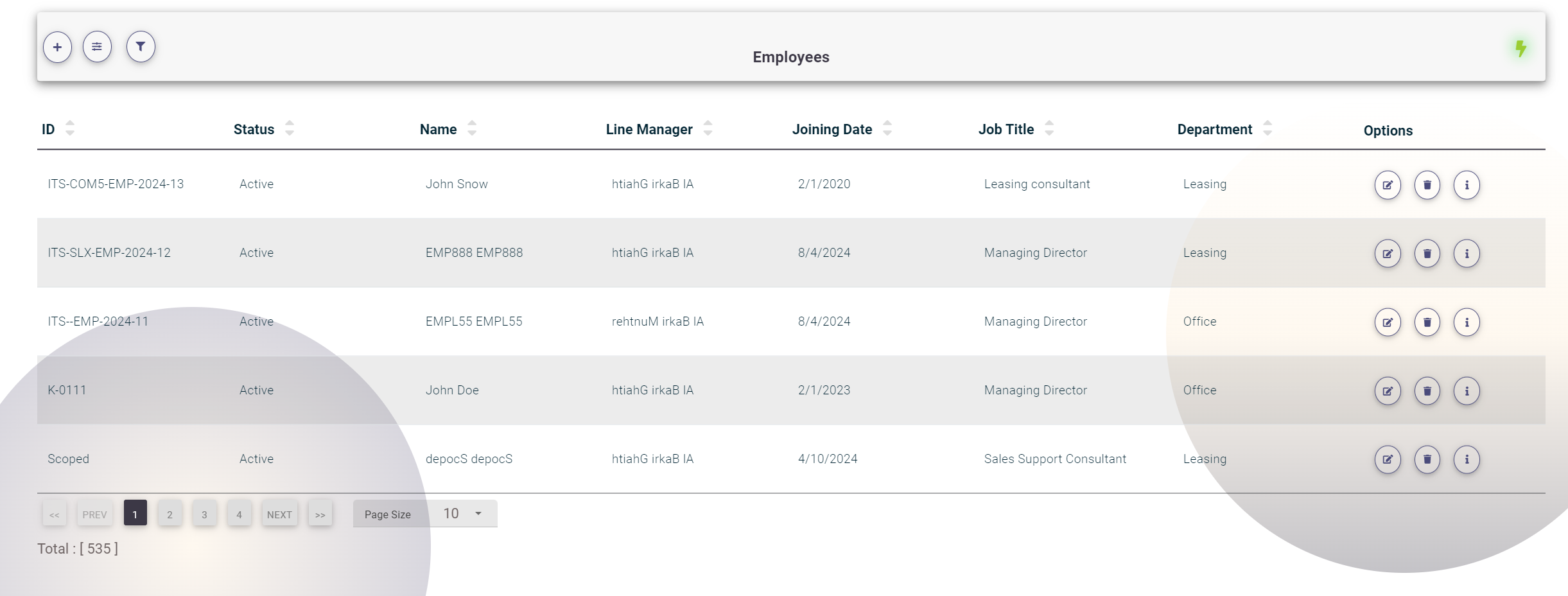
The Grid component in ITSERP is used across the system to display and manage list data. Here's a detailed overview of the key features and functionality of the Grid:
Advanced Search
Click on the Bars Icon at the top of the Grid to open the advanced search panel.
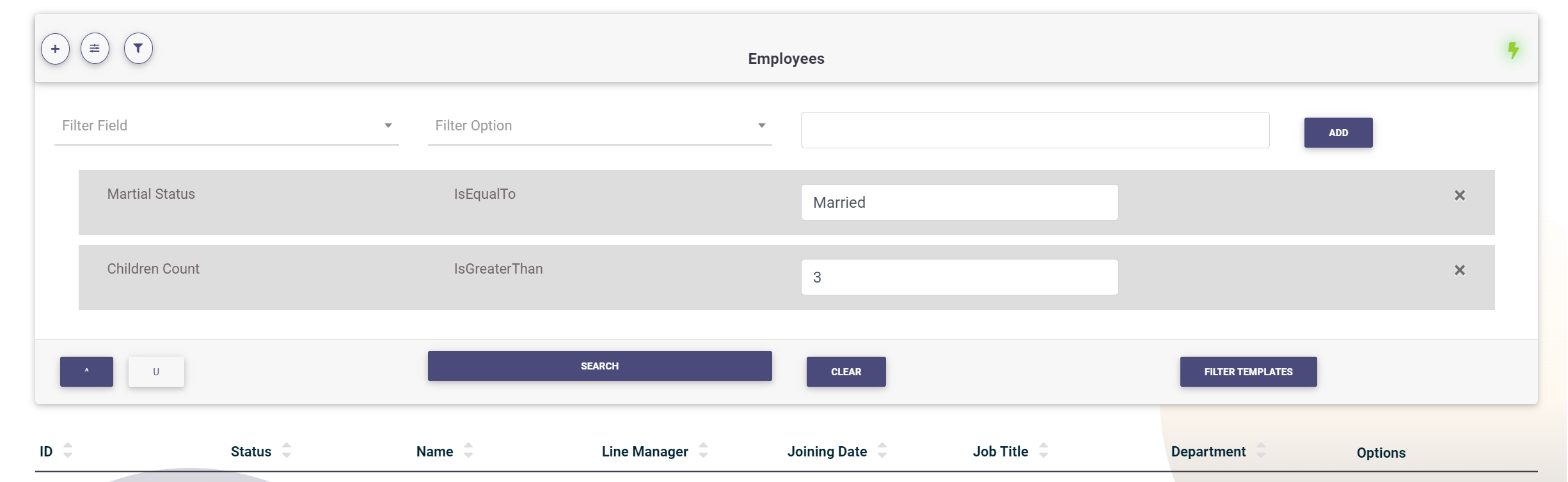
In the advanced search, users can build their filters by selecting the filter field, the filter operation, or option, and the filter value. Click Add to apply the filter.
Filter Options:
- Numeric and Date Fields:
- Is Greater Than
- Is Greater Than Or Equal To
- Is Less Than
- Is Less Than Or Equal To
- Is Equal To
- Is Not Equal To
- Text Fields:
- Starts With
- Ends With
- Contains
- Does Not Contain
- Is Empty
- Is Not Empty
- Is Equal To
- Is Not Equal To
- Boolean (True or False) Fields:
- Is Equal To
- Is Not Equal To
The available filter options will automatically change depending on the selected filter field. The filter value input control will also change based on the selected field, appearing as a numeric input, date picker, text field, or drop-down menu. Users can add multiple filters and combine them using the ^ (AND) or U (OR) operators. Click on Search to fetch the filtered data.
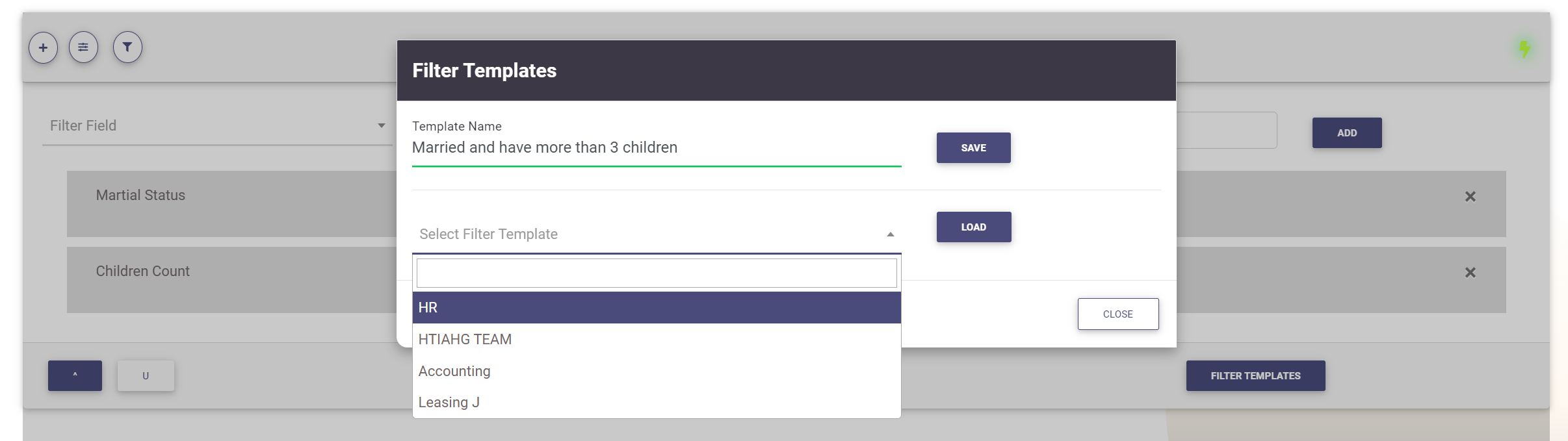
Saving and Loading Filter Templates
Users can save created filters as a template for later use. After adding the filters, click on the Filter Templates button. A popup will appear where you can save the current filters by setting a filter name and clicking Save. From the same popup, users can load saved templates by selecting the template name and clicking Load.
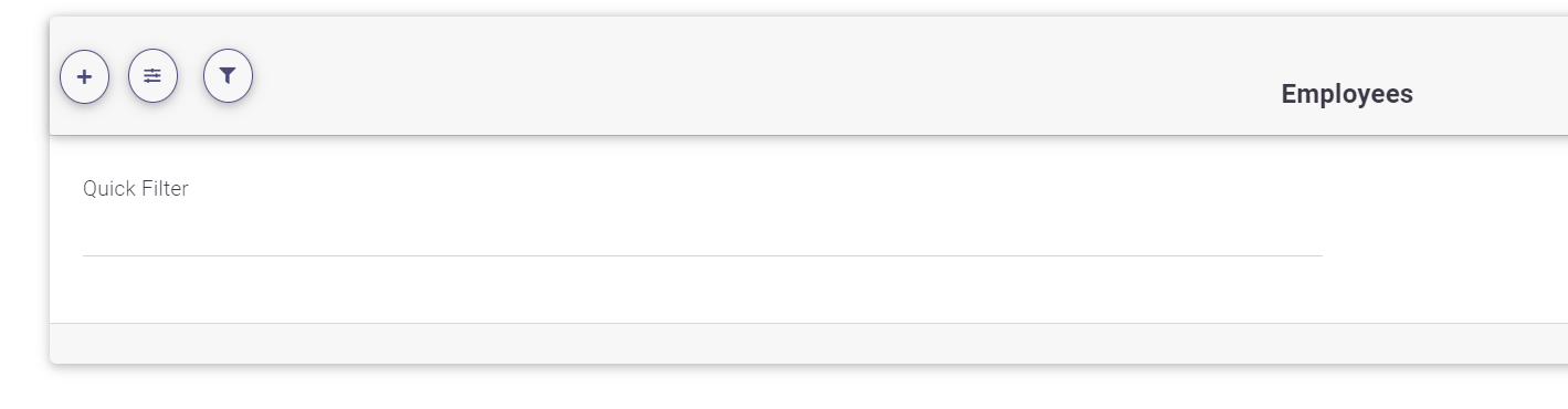
Quick Filter
Users can quickly search by typing into the search text field and pressing Enter or clicking outside the input field. The quick filter will search all text fields and return all matches using the "Contain" operator by default.
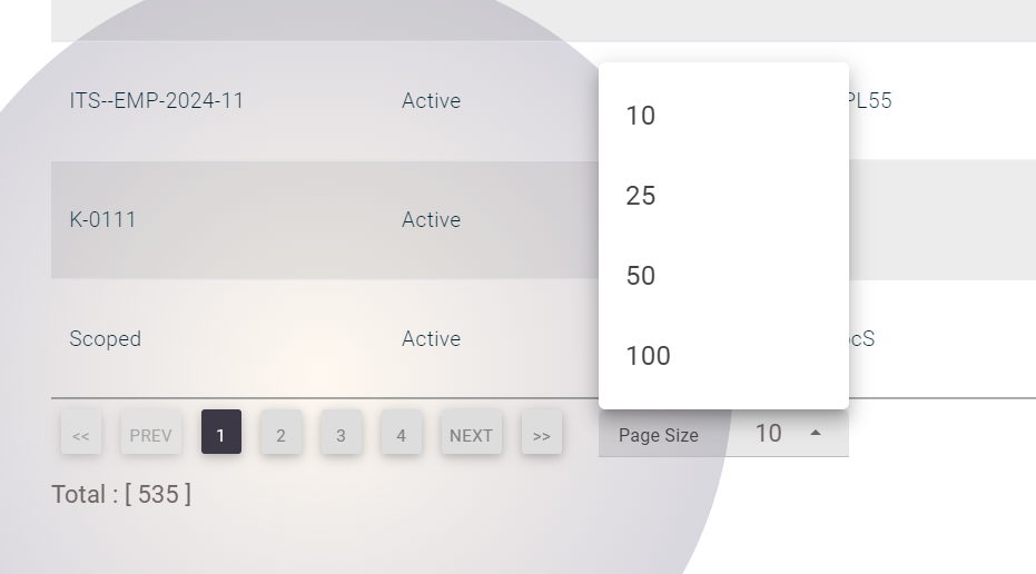
Grid Navigation
The Grid loads the first 10 items by default. Users can navigate through Pagess by clicking on the Pages numbers below the Grid. Click on "<<" to go to the first Pages, ">>" to go to the last Pages, or use the Next and Prev buttons to move forward or backward through Pagess. Users can select the Pages size from the available options: 10, 25, 50, or 100 items per Pages. The total number of items will be displayed under the grid navigation controls.
Sorting the Grid
Users can sort the Grid by any field by clicking on the arrows next to each field label in the first row. The up arrow sorts in ascending order, and the down arrow sorts in descending order. Sorting can be applied to only one field at a time.
This Grid component provides a powerful and flexible way to manage and interact with data across ITSERP.